
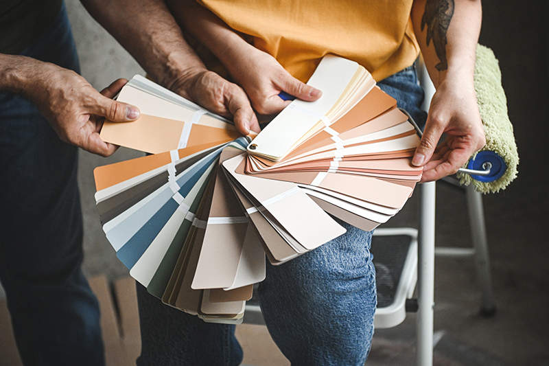
Give your Bayfield County home a true South Shore feel with colors drawn from Lake Superior, clay bluffs, soft morning fog, and the surrounding forest
Bayfield County has its own color language. You see it in the deep blue of Lake Superior, the warm clay tones along the shoreline, the quiet greige of misty mornings, and the softened greens of the forest. These colors are not loud or overly polished. They feel calm, grounded, and naturally connected to the place.
Table of Contents:
When choosing paint colors for your coastal home, be guided not just by design trends, but by your surroundings. Around the South Shore, the coastal color palette works best as it reflects what is already outside the window: water, trees, stone, sky, and seasonal light.
In this guide, we will walk through four core color families inspired by the South Shore: Water, Clay, Fog, and Forest. Together, they create a palette that feels timeless, flexible, and distinctly tied to this corner of northern Wisconsin.
The South Shore’s Coastal Palette: What to Keep in MindWater grounds the room. Deep navy and inky blue bring structure, contrast, and a quiet sense of depth. Clay adds warmth. Terracotta, russet, and muted clay tones balance cooler northern light and make a home feel more inviting. Fog keeps everything soft. Greige, mushroom beige, and warm neutrals create an easy backdrop that works across seasons. Forest brings calm. Smoky jade, sage, and muted green tones echo the wooded edges of Bayfield County and help rooms feel restful. The goal is balance, not theme. The best coastal home paint colors do not make a house feel decorated around a concept. They make a home feel natural where it is. |
The Curated South Shore Palette

From inky blues to softened greens, the South Shore offers a natural palette that feels calm, layered, and easy to live wit
The South Shore beach color house palette works because it already exists in the landscape. Lake Superior provides the depth. The clay bluffs bring warmth. Morning fog softens the edges. The surrounding forest adds quiet, grounding color. Instead of choosing shades that compete with the setting, this palette borrows from it. These four color families can be used together or introduced slowly, depending on how much change you want to bring into your home.
Water: Deep, inky navy blue
There is a certain stillness to Lake Superior on overcast days, when the water color deepens, and the horizon begins to blur. Inky navy captures that mood beautifully. It feels grounded, classic, and slightly dramatic without becoming too sharp or formal.
Among coastal home paint colors, navy works best as an anchor. It gives a room structure, especially when paired with warm whites, natural wood, woven textures, or lighter stone. Used thoughtfully, it can make a space feel more settled rather than darker.
Paint colors to sample: Benjamin Moore Hale Navy, Sherwin-Williams Inky Blue, or Miller Paint Into The Stratosphere.
Where it works best: lower kitchen cabinets, a kitchen island, a dining room accent wall, built-ins, an office, or a powder room. Keep it to one or two focal areas so the color adds depth without taking over.
Clay: Terracotta, russet, and muted earth tones
The South Shore is not all blue and green. The land brings its own warmth through clay-rich earth, weathered stone, and the soft mineral tones found along the shoreline. Terracotta and muted clay shades are especially helpful in homes that receive cooler northern light, because they bring in warmth without feeling overly bright.
These colors can add personality quickly, so the key is restraint. A little clay goes a long way. Used in the right place, it can make an entryway, mudroom, powder room, or fireplace surround feel more welcoming and rooted.
Paint colors to sample: Sherwin-Williams Cavern Clay, Sherwin-Williams Redend Point, or Benjamin Moore Audubon Russet.
Where it works best: entryways, mudrooms, built-ins, fireplace surrounds, accent walls, or smaller rooms where you want warmth and character. Pair clay tones with greige, cream, sage, or natural wood to keep the palette balanced.
Fog: Greige, mushroom beige, and soft neutrals
Fog is the quietest part of the palette, but it may be the most useful. Greige and mushroom beige reflect the softer side of the South Shore: misty mornings, pale stone, weathered wood, and diffused light over the lake.
These shades make excellent foundation colors because they do not demand attention. They create a calm backdrop for the rest of the palette and allow navy, clay, and sage to stand out in smaller doses. In open-concept living areas, soft neutrals also help rooms flow together without feeling flat.
Paint colors to sample: Sherwin-Williams Universal Khaki, Behr Creamy Mushroom, or Benjamin Moore Baby Fawn.
Where it works best: main living areas, hallways, bedrooms, open-concept spaces, and any room where you want a warm but understated base. To keep the look fresh, layer in white trim, linen textures, wood accents, and one or two deeper tones from the palette.
Forest: Smoky jade, muted sage, and softened green
Green on the South Shore is rarely bright. It is softened by mist and grounded by the surrounding land. That is why smoky jade and muted sage feel so natural in Bayfield County homes. They bring in color while still feeling restful.
These greens work especially well in rooms meant for quiet: bedrooms, bathrooms, reading corners, and guest spaces. They also pair beautifully with wood, stone, creamy whites, and warm neutrals. The trick is to let one green lead rather than layering too many competing shades.
Paint colors to sample: Behr Hidden Gem, Sherwin-Williams Sea Salt, or Benjamin Moore Louisburg Green.
Where it works best: bedrooms, bathroom vanities, cabinetry, guest rooms, laundry rooms, or small accents throughout the home. Pair with greige or warm white if you want a softer look, or with navy if you want more contrast.
Taken together, Water, Clay, Fog, and Forest create a palette that feels distinctly tied to Bayfield County without becoming too literal. The goal is not to make every room look coastal. It is to choose coastal home paint colors that help the home feel calm, balanced, and connected to the landscape around it.
Using the Palette at Home

For smaller rooms, a single well-chosen color can create more character than a complicated palett
Choosing the right colors is only the first step. The real difference comes from how those colors move through your home. A South Shore-inspired palette should feel calm, not overly matched. You do not need navy, clay, greige, and sage in every room. In fact, the best results often come from choosing one main color family, then letting the others appear in smaller, quieter ways.
Think of the palette as a conversation between your home and the landscape outside. Some rooms may need the softness of Fog. Others may benefit from the depth of Water or the warmth of Clay. The goal is to create flow without making every space feel the same.
Start with the light
Before you commit to any paint color, pay attention to how natural light moves through the room.
Homes near Lake Superior can experience cooler reflected light, especially on gray days or during the winter months. A shade that looks warm on a sample card may feel cooler once it is on the wall. Likewise, deeper colors can feel rich and cozy in one room, then heavy in another.
Test your coastal home paint colors in the actual space before painting. Use large samples or paint boards, then check them in morning light, afternoon light, and lamplight. It is also worth comparing them against your flooring, trim, cabinetry, and natural wood features, since those surfaces can shift how the color reads.
Let one color lead
A balanced room usually has one clear lead color. That may be a soft greige on the walls, a navy island in the kitchen, a sage vanity in the bathroom, or a clay-toned accent in an entryway.
Once that lead color is chosen, everything else should support it. If Fog is your foundation, Water or Forest can add contrast. If Clay is your statement, soft neutrals can keep it from feeling too bold. If Water is the anchor, warm wood and lighter walls can prevent the room from feeling closed in.
This is where the classic 60-30-10 rule can help:
- Use about 60% of one dominant color for the main backdrop.
- Use about 30% of a secondary color through furniture, cabinetry, rugs, or accents.
- Use about 10% of a stronger accent color in smaller details.
You do not need to follow the formula perfectly. It is simply a helpful way to keep the room from becoming too busy.
Save the boldest colors for places with purpose
Navy, clay, and deeper greens can be beautiful, but they work best when used with intention. Instead of spreading bold color everywhere, give it a specific job.
Use navy to ground a kitchen island, office, or dining space. Use clay to warm up a mudroom, powder room, or fireplace surround. Use sage or smoky jade in bedrooms and bathrooms where a quieter mood makes sense.
Smaller spaces are also good places to try color-drenching, where the walls, trim, and even ceiling are painted in the same shade. In a powder room, office, or guest room, this can feel polished and immersive without overwhelming the rest of the home.
Keep the whole house in mind
If one room uses a deep navy, you might repeat that color later in a piece of art, a rug, or a small cabinet detail. If your main living area is greige, a nearby bedroom in sage can feel related without being repetitive. If clay appears in an entryway, a softer version of that warmth can show up in textiles or wood tones elsewhere.
Lake house paint colors are used in cabins and open-concept homes where rooms often flow into one another. A thoughtful palette gives each space its own mood while still making the home feel cohesive.
Add warmth after dark
Paint colors change once the sun goes down, so lighting matters as much as the color itself. Warm white bulbs, usually around 2700K to 3000K, can make clay, greige, and sage tones feel softer and more inviting. Layered lighting also helps. Instead of relying only on overhead fixtures, bring in lamps, sconces, and task lighting so the color has more depth in the evening.
This is a small detail, but it can make the difference between a room that feels flat and one that feels settled, warm, and comfortable year-round.
The Soft Touch: Bringing the Palette In Without Repainting

Not every South Shore-inspired update needs to start with a paintbrush. Art, textiles, natural textures, and small accents can bring the palette into your home gradually.
A full paint project is not the only way to bring the South Shore palette into your home. If you are still deciding how bold to go, start with smaller details that let you live with the colors first.
If you are drawn to the navy side of the palette, try it through pillows, throws, bedding, or artwork. Warmer clay tones can come through ceramics, rugs, vases, or a small accent piece. Soft neutrals work well in linen, wool, light wood, and other natural textures. Muted greens can be introduced through pillows, greenery, landscape photography, or even a painted side table.
Wood, stone, woven baskets, pottery, pressed ferns, cedar clippings, and simple greenery can all echo the South Shore without making the room feel overly themed.
These smaller updates also make seasonal shifts easy. Keep larger pieces neutral, then rotate accents as the light and weather change. It is a simple way to bring coastal home paint colors into your space before committing to walls, cabinets, or trim.
Frequently Asked QuestionsWill neutral tones make my home feel too dark in the winter? Not if they’re used thoughtfully. Many coastal home paint colors include lighter neutrals that reflect available light. If a room feels dim, prioritize higher LRV shades for walls and reserve deeper tones like navy for accents. This keeps the space feeling balanced year-round. How does the reflection from Lake Superior affect paint choices? The lake can amplify brightness and introduce cooler tones into your home. That’s why softer, slightly muted colors tend to work best. They help absorb and balance that reflected light rather than competing with it. I have a lot of natural wood—what colors work best? Wood brings warmth, so contrast is key. Sage greens, muted blues, and warm greiges pair especially well. These coastal home paint colors complement wood tones without clashing, creating a more cohesive look. Why does paint look different on my wall than on the swatch? Swatches are viewed in isolation, while your walls reflect surrounding light, flooring, and furnishings. Always test larger samples directly on your walls and observe them throughout the day before committing. How does light change color in a home? Light direction matters. North-facing rooms tend to feel cooler and softer, while south-facing spaces are brighter and warmer. East and west exposures shift throughout the day. Understanding this helps you choose colors that stay consistent and comfortable over time. |
Give Your Bayfield County Home A South Shore-Inspired Refresh
From layering a thoughtful palette to testing swatches in natural light and incorporating subtle, low-commitment updates, each step helps create a home that feels cohesive. Choosing coastal home paint colors inspired by the South Shore ensures your space feels natural, never forced or out of sync with its surroundings.
If you’re considering a move or investment here, Broad Street Brokers is ready to help. Call 715.779.3220 or send a message to book a free consultation.